
Visual Designer (Component Configuration)
DocCoreX Studio allows you to customize each element of your template through a dynamic properties panel.
🛠️ Properties Panel
When selecting any component on the canvas, the right panel activates to show its specific settings.
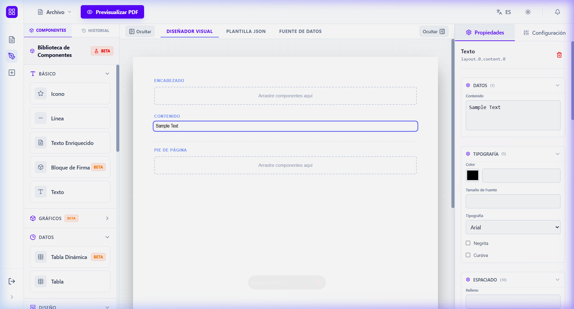
Common Sections:
- Content/Data: Defines the static text or the dynamic variable (
{{field}}) that the component will display. - Visual Styles: Adjust font colors, backgrounds, borders, and corner rounding (Radius).
- Layout: Controls width, height, alignment, and conditional visibility.
- Spacing: Fine-tune margins (Margin) and padding (Padding).
🧩 Component Library (Stable)
Below are the components ready for production.
🖋️ Basics
- Text: For simple labels and short paragraphs.
- Rich Text: Supports advanced formatting and multiple lines.
- Line: Horizontal or vertical visual separation element.
- Icon: Integrated Lucide icon library for signage.
- Image: Embed logos or photos from URLs or Base64.
📊 Data & Charts
- Table: Row and column structure for tabular data.
- Charts: Includes Bar Chart, Pie Chart, Radar Chart, Funnel, Treemap, and Sparklines for metric visualization.
📐 Layout & Structure
- Container/Box: Groups of elements with their own styles.
- Row & Column: For creating grids and complex distributions.
- Spacer: Generates calculated gaps between elements.
- Header & Footer: Reserved sections to repeat on every sheet.
- Page Break: Forces the start of a new page in the PDF.
[!IMPORTANT] Components marked as BETA in the Studio library (such as QR Codes, Barcode, or complex Dynamic Tables) are in the testing phase and are not included in this general guide for stability reasons.
[!TIP] You can use the
DeleteorBackspacekey to remove a selected component from the canvas.